Introduction: Businesses in today’s data-driven world rely significantly on data visualization and analysis to make wise decisions. The way businesses interact with their data has been changed by Tableau, a potent data visualization tool. Tableau enables users to build dynamic dashboards that bring data to life because to its user-friendly design and comprehensive capabilities. In […]
Category Archives: Data Visualization

06
Feb
Feb
Tableau is a powerful data visualization tool Tableau is a powerful and feature-rich data visualization tool that enables users to create interactive and shareable dashboards and reports. It is designed to be easy to use, even for users with limited technical skills, and offers a range of pre-built templates and visualizations to help users get […]
03
Feb
Feb
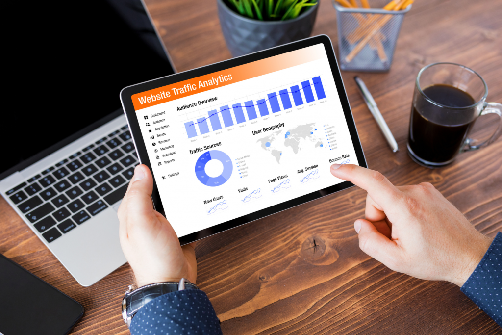
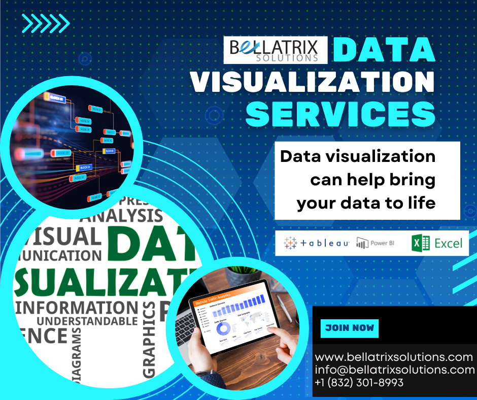
Data visualization is the process of representing data and information in graphical or visual format. It helps to make complex data more understandable and easier to interpret, enabling users to see patterns, trends, and relationships that might not be immediately apparent from raw data. There are many benefits to using data visualization, including: Improved communication: […]

03
Feb
Feb
Microsoft Power BI is a cloud-based business analytics service that provides a range of tools and features for creating and sharing data-driven insights. It enables users to connect to a wide range of data sources, visualize and analyze data, and create interactive and shareable dashboards and reports. One of the key benefits of Power BI […]

22
Sep
Sep
As great of a tool tableau is, there’s always an issue with a custom request from the users creating a calendar on the dashboard, creating excel sheets, or even a custom apply button on filters. This writing will give you the idea of creating a filter that would simultaneously apply to all your filters. Let’s […]

16
Aug
Aug
How Does Data Visualization Work? Defining, describing, and providing examples Data visualization involves presenting information visually. To view trends, outliers, and patterns, charts, graphs, and maps are useful. Big Data enables the analysis of vast amounts of information and the taking of data-driven decisions through the use of data visualization tools. Getting started with data […]