Introduction:
Businesses in today’s data-driven world rely significantly on data visualization and analysis to make wise decisions. The way businesses interact with their data has been changed by Tableau, a potent data visualization tool. Tableau enables users to build dynamic dashboards that bring data to life because to its user-friendly design and comprehensive capabilities. In this blog article, we’ll look at some excellent instances of interactive dashboards made with Tableau and discuss best practices for doing so.

Recognize Your Audience Understanding the target audience and their unique needs is vital before starting the dashboard design process. Think about their level of technical skill, their desired outcomes, and the main insights they seek. This knowledge will direct the dashboard’s functionality and design, ensuring that it provides users with the most benefit possible.
Keep It Simple and Intuitive: Simplicity is one of the guiding principles of successful dashboard design. Keep the dashboard free of superfluous images and complicated layouts that could confuse consumers. Maintain a simple, well-organized layout that enables consumers to explore and understand the information offered. Labels, headings, and tooltips should be clear and succinct in order to help users navigate the dashboard and offer context.
Making Use of Interactive Elements Tableau’s interactive features are where its greatest power rests. Utilize these options to produce interactive dashboards that promote user exploration. Include quick actions, filters, and settings to let users engage with the data and alter how it appears to them. Users are given the ability to ask questions, gain knowledge, and identify significant trends in the data thanks to this interactivity.
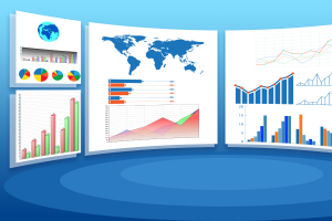
Use the Right visuals: A key component of delivering information successfully is selecting the appropriate visuals. Tableau provides a variety of graphs, maps, and charts for representing data graphically. Choose visualizations that are most appropriate for the data type and the intended audience. To strategically accentuate significant data points and highlight essential insights, use color, size, and other visual signals.
Design for Responsiveness: In light of the growing prevalence of mobile devices, it’s critical to make sure your dashboards are adaptable to various screen sizes. Tableau offers adaptable design choices that let you adapt the dashboard’s layout to different devices. To provide a consistent user experience across platforms, test the dashboard on different screen resolutions.
Tell a Compelling tale: A well-designed dashboard leads users through a narrative flow and tells a tale. When designing your dashboard, think about the logical order in which users should consume information. To give context and lead viewers through the data story, utilize tooltips, captions, and annotations. You may improve knowledge and make decisions easier by presenting data in a logical and relevant way.
Dashboard for Sales Performance, as an example. Consider a sales manager who wants to keep an eye on how well their sales team is performing. Visualizations like a line chart indicating historical sales patterns, a stacked bar chart comparing sales by region, and a scatter plot illustrating the correlation between sales and customer happiness might all be included in the dashboard. The manager might analyze sales performance thoroughly by using interactive filters to drill down into particular geographies or time periods.
Example 2: A dashboard for social media analytics A dashboard could feature visuals like a heat map showing popular posting times, a word cloud displaying trending hashtags, and a network graph demonstrating the relationships between influencers for a marketing team monitoring social media interaction. The team may be able to examine various social media platforms, target audiences, or particular campaigns thanks to interactive elements like filters and parameters, which could provide insightful information for improving their social media strategy.
In summary, Tableau offers a strong foundation for building interactive dashboards that let users extract useful information from data. You can develop effective dashboards that encourage data-driven decision-making by adhering to best practices like identifying your audience, keeping the design simple, incorporating interactivity, selecting the right visualizations, designing for responsiveness, and presenting a compelling story. Discover Tableau’s extensive possibilities to maximize the effectiveness of your data visualization projects.